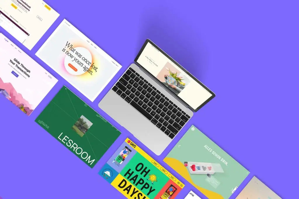
Honor to whom honor is due! These are the 8 websites we declare our love for today. From a note-taking app to a wooden house designer.
Aaahhhh, life as jut-so, waa? Lolling lasciviously in the office chair, listening to the opera singer from the office next door (true story), and for this purpose stealing a few ideas, looking for inspiration on the Internet.
Let’s face it: we communication fetishists get our hands wet every time we see websites that dare to have personality while remaining functional and understandable. Some of them we want to declare our love with this post. We love you – and that’s just fine.
#1 my mind
With a wonderfully tidy but never boring site, the thought sorters from my mind catch my mind eye. Their product: an A.I.-powered pinboard for all the notes, links, pictures, and inspirations we’d otherwise lose track of.
The modern A.I. approach is cushioned by a lively, more classic serif typeface. In addition, my mind serves up crisp texts and precise product descriptions.
What’s good:
- well-digestible page layout
- original Color palette
- Contents get to the point
- Optimal text lengths
Where there is potential:
- “What” page sells better than the home page (swap?)
- Product videos would enhance the page
- less gobbledygook in the “Why” section
#2 Christou Days
The Feeling of DAYS is somewhere between sunburn, gummy bears, and contraceptives. What do they sell? Of course – shoe insoles. Whoever manages to breathe so much personality into such a boring product deserves respect and all the success.
The site scrolls horizontally, elegantly weaves animations and videos into the user flow and is just about the most beautiful foot-friendly website we’ve ever seen.
What’s good:
- bold color selection
- horizontal scrolling is used sensibly
- sympathetic illustrations & animations
- Match for an imaginative target group
Where there is potential:
- white font on images is not always easy to read
#3 5 a day
5 a day is an initiative for more vegetable and fruit consumption. A great opportunity for designers! The design is as colorful as a fruit salad and scores with easily digestible morsels of information.
In addition to the design, solid content is served up: Recipes, tips, and know-how around vitamin-rich delicacies that make you healthy and lively. Freely according to the motto: Try Vegetables.
What’s good:
- colorful, but not obtrusive
- meaningful content
- self-explanatory page structure
Where there is potential:
- Texts could be crisper and more fun
- the “Why” is super (health) – should be in the Hero
- The page appears very static
#4 glide
Document and data management is pretty dull. That’s precisely why we tip our hats to glide. The site for real estate agents is lively, well structured and leaves room to breathe. At the heart of the user experience is an elegant simplicity that condenses subpage by subpage.
All pages are easy to understand. In addition, there is a Help Center with detailed information. You can’t do much better than that.
What could be better:
- elegant simplicity
- strong user guidance
- modern, lively look & feel
- Mini animations
Where there is potential:
- we are still looking for something
#5 Octaveo
If there was an Olympus for product photography, Octaevo would be Scrooge McDuck! Wait… huh? Well, anyway, the Octaevos sell design pieces from flower vases to greeting cards in their online store. The whole thing goes over wonderfully elegantly – with pastel colors, graceful serif typeface and said-stylish product photos.
We especially like the balance between shopping and admiring. You’re almost happy to pay 15 euros for a bookmark.
What’s good:
- Pleasant color palette
- High-end feeling comes across
- elegant Typo
- good store structure
Where there is potential:
- Vision to the home page
- Typo hierarchy on the store pages goes down a bit
#6 Rows
Do you already know this one? Goes an Excel spreadsheet in a bar and takes steroids. That’s it! It’s not a joke at all. Rows is a pimped Excel application whose website convinces with beautiful illustrations and a strong typography concept.
Our designers’ mouths water at such a clean implementation. The downside: The illustrations could be used a bit more often.
What’s good:
- Illustration concept
- coherent typography selection
- Beautiful color selection
- pixel perfect implementation
Where there is potential:
- Give us MORE of the awesome illustrations
- Font size 14 is a challenge at high resolutions
#7 Capsul’in
We’ve always been fans of coffee beans (here: coffee capsules), which in the vertical case take us through a one-pager. Capsul’in didn’t reinvent this – but their coffee capsules did. After all, they are 100% bio-based.
In keeping with the product, the page features natural shades of green and brown, while the sans-serif modern font hints at the modern technical aspect. A successful overall concept.
What’s good:
- strong web concept
- dynamic, central element
- Good color selection
- “Wow” effect due to lateral guidance
Where there is potential:
- Headline font looks a bit sterile
#8 Lesroom
Lesroom is one of those sites that you love and hate at the same time. You love it because everything fits: good structure, bold design, great animations, super images and meaningful videos. And why do people hate them? For the same reason. It is just too good.
Sold are modular, self-designed wooden houses. That’s why there are many corners and edges in the design that fit the concept perfectly. This site is a revelation.
What’s good:
- stylish animations
- sophisticated user experience
- Website is very dynamic
- much attention to detail
Where there is potential:
- we also ask ourselves