Business Intelligence for Luftbude

Data gold instead of Excel chaos: business intelligence for an online store

A modern online store displays various ventilation products in a clear grid layout with prices and call-to-action buttons. Through user-centered web design, we guide users intuitively and barrier-free to the conclusion of the purchase.

Summary

Specialist ventilation wholesaler Luftbude was growing and growing, but its data was stuck in an Excel jungle. Decisions were often based on gut feeling and outdated reporting. That’s exactly what we changed: By setting up a central data lake and automated Python pipelines, we linked sales, purchasing and marketing into a “single source of truth”. The result is a business intelligence solution that turns the entire corporate management system on its head.

Client

Luftbude GmbH

Industry

E-Commerce & LifestyleIndustry & trade

Service

Time Frame

1.1 Jahre · 02.05.2025 – heute

Team

Christopher Carus

Tools

n8n, Google Looker Studio, Python, Google Cloud, HubSpot, Shopware, Google Analytics 4 (GA4), BOMITO, Airbyte, Google BigQuery

Collab

The highlights

0 h

Manual reporting effort

100 %

Transparency about real margins

6

Data sources combined

The challenge

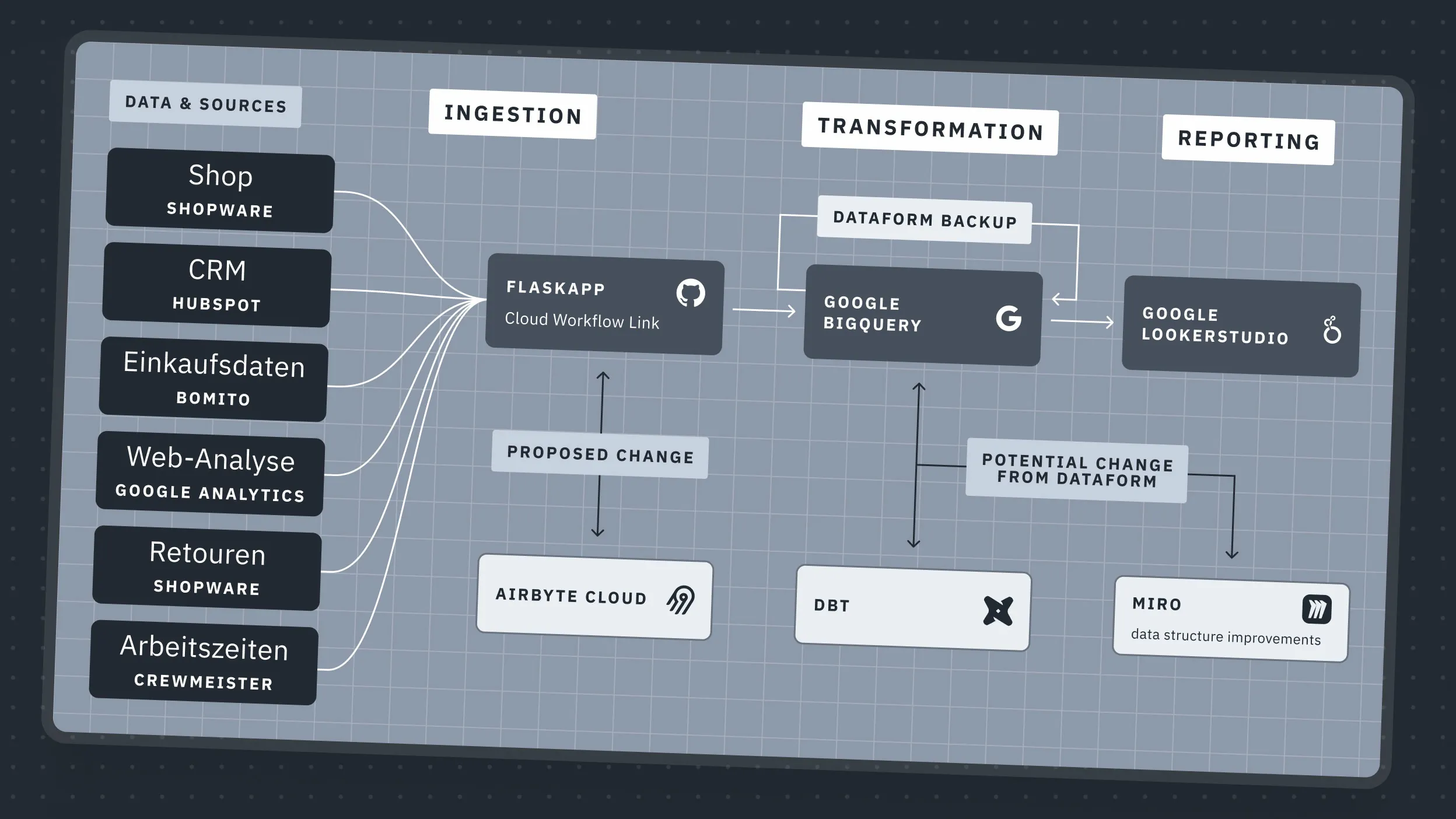
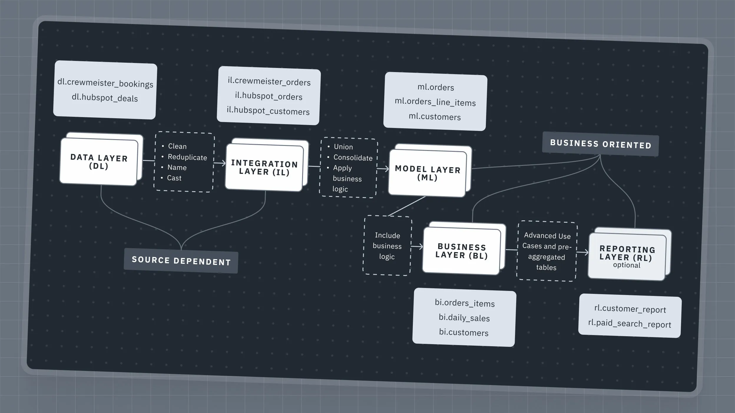
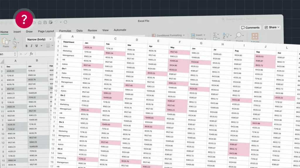
Many entrepreneurs are familiar with this: the company is growing – but the overview is dwindling. At Luftbude’s online store, the reporting landscape consisted of a historically grown proliferation of manual Excel files. The data from the store, CRM, purchasing and web analytics was stored in silos. By the time a report was ready, it was out of date.

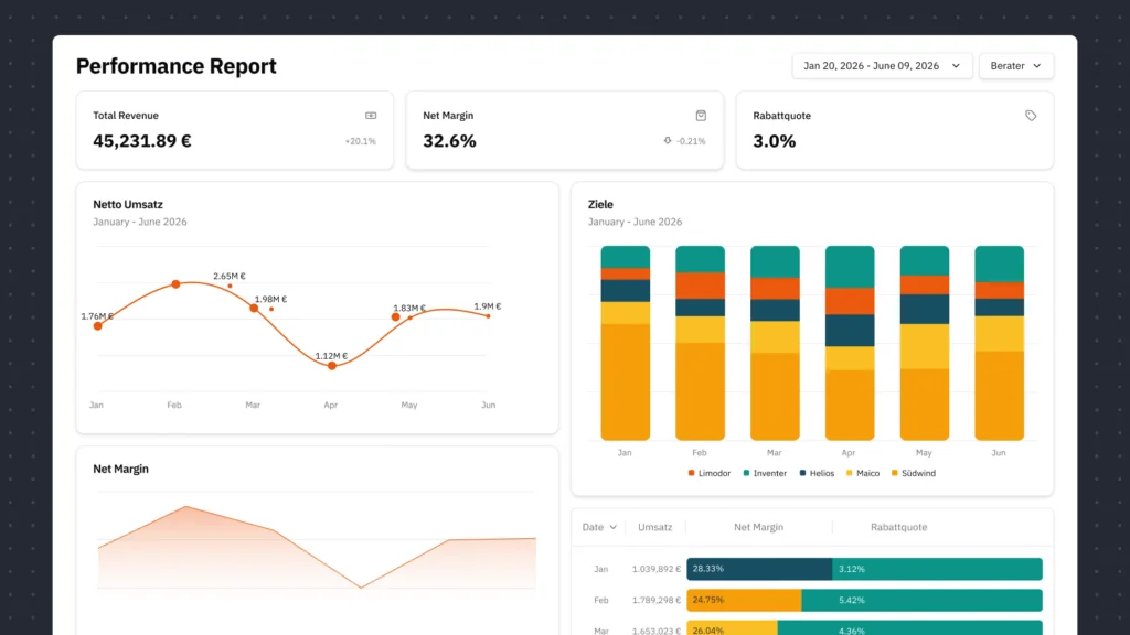
The big problem: looking at turnover did not show the actual profitability. Without linking purchasing data, returns and working hours, it remained unclear which deals were really making money and which were burning money. The goal was clear: to move away from manual chaos and towards a reliable, automated database.

Ein Screenshot der Automatisierungsplattform n8n zeigt einen detaillierten Trigger-Flow. Die visuelle Benutzeroberfläche verknüpft verschiedene Datenpunkte wie Shopware und Hubspot intelligent miteinander. Wir implementieren solche robusten Schnittstellen für eine effiziente Prozess-Automatisierung, die Nutzer:innen fehleranfällige und manuelle Arbeit abnimmt.

Complex n8n workflow automates data exchange between different systems in real time.

Ein Architektur-Diagramm zeigt die Datenintegration aus Quellen wie Shopware und Hubspot über Tools wie Airbyte und dbt hin zu Google Lookerstudio. Wir implementieren solche automatisierten Datenpipelines für ein datengetriebenes Marketing.

Schematic representation of an ETL data pipeline integrating various system sources into a central dashboard.

Strategy

We started with a proof-of-concept in n8n to validate our hypotheses. For scaling, we switched to customized Python pipelines in Google Cloud. We tapped into all relevant veins – Shopware for orders, HubSpot for sales pipelines, GA4 for user behavior and even the phone system for operational signals.

We brought these data worlds together in a central data lake (Google BigQuery). The decisive strategic lever was normalization: we defined logics that offset sales with purchase prices and working hours. This resulted in an architecture that independently intercepts errors and automatically collects and refines data.

Ein Flussdiagramm illustriert den Weg von Daten durch verschiedene Ebenen, vom Data Layer bis zum Reporting Layer. Unsere Strategie-Beratung entwirft solche skalierbaren Dateninfrastrukturen für wachstumsorientierte Unternehmen.

Structured layer model plans the modern data architecture from the raw data source to reporting.

Die Benutzeroberfläche einer Microsoft Excel-Tabelle auf einem Mac. Dieses Bild steht stellvertretend für die unzähligen, oft unübersichtlichen Tabellen voller Rohdaten, die wir durch intelligente Softwareentwicklung und Automatisierung in aussagekräftige Dashboards transformieren.

The Excel table below symbolizes the status quo of many companies before our data transformation.

Ein aufgeräumtes, digitales Performance-Dashboard präsentiert exemplarische Kennzahlen wie Umsatz, Marge und Zielerreichung in klaren Diagrammen. Wir entwickeln solche maßgeschneiderten UI-Designs, damit Nutzer:innen aus ehemals unübersichtlichen Tabellen sofort handlungsfähiges Wissen generieren.

Exemplary performance dashboard demonstrates the clarity we gain from complex data sets.

"Data is only valuable when it hurts or makes you cheer. We didn't just visualize figures, we linked the purchasing and sales data. Suddenly Luftbude can see where they're really making money - and where it's just trickling away."
Christopher Carus (CTO)

Result

Today, Luftbude no longer acts on instinct, but on data. In Looker Studio, the management looks at dashboards that update themselves. The system exposes unprofitable products and identifies the true sales drivers.

Sales staff now see their performance based on contribution margins, no longer just on turnover – a massive incentive to act profitably. VIP customers are recognized early on and consulting capacities are distributed more efficiently. Data transparency has created a new corporate culture in which profitability comes before volume.

Surprise! there's more.

And you thought that was it, didn’t you?

Looking for your new
favorite agency?

Discuss your next project with Christopher

Christopher has algorithms in his blood and loves to dance the firefox trot