Netcom website relaunch

When the IT service provider itself needs a system update

A collage showing various results of the Netcom project, including logo design, website layouts and the user persona - an example of holistic brand strategy.

Summary

Netcom CS protects the communication of critical infrastructure such as power grid operators, data centers and educational institutions. However, the company’s own website was getting on in years. It needed a system update – literally. The result is a modern platform that bundles IT solutions in a user-friendly way, attracts talent via Personio and gives the brand a fresh look.

Client

Netcom Connected Services GmbH

Industry

IT & Digital

Service

Time Frame

5 Monate · 01.04.2024 – 30.08.2024

Team

Jannis Riethmüller, Mark Eulert, Christopher Carus, Julian Hoff

Tools

Figma, Wordpress

Collab

The highlights

100 %

Automated synchronization of job advertisements via Personio

100%

Logical sitemap architecture for taming extremely complex B2B content

100 %

Retention of the corporate design – cleverly modernized for the target group

The challenge

Secure communication for wind farms. Networks for data centers. If you sell something like this, you need a website that exudes trust at first glance. The old website no longer did this. It looked outdated, even though the company behind it provides its customers with state-of-the-art security solutions.

Our task: Organize dozens of B2B services and industry information logically. Create a space for sales meetings and recruiting. And all with a corporate design that looked more like tradition than tech.

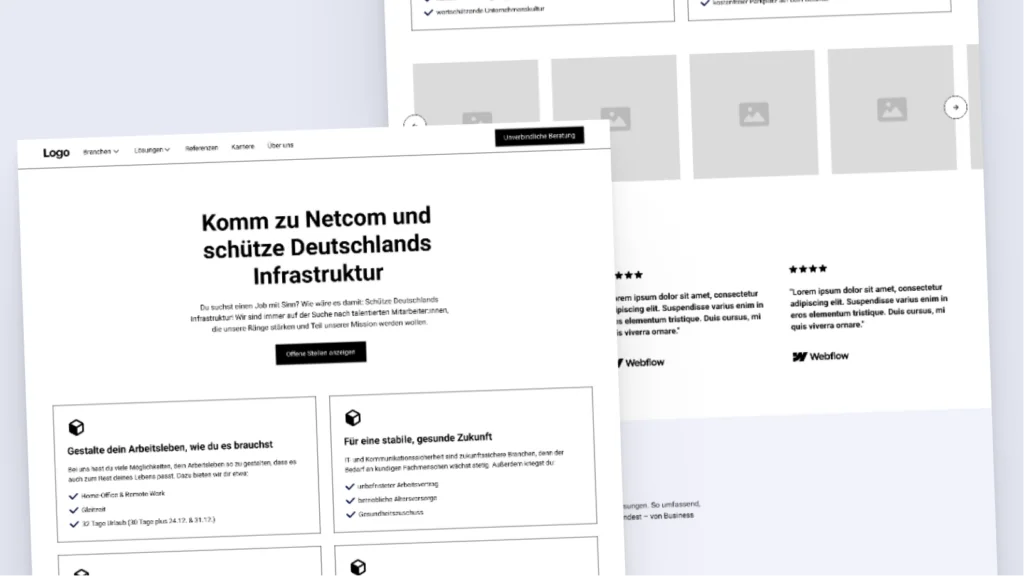
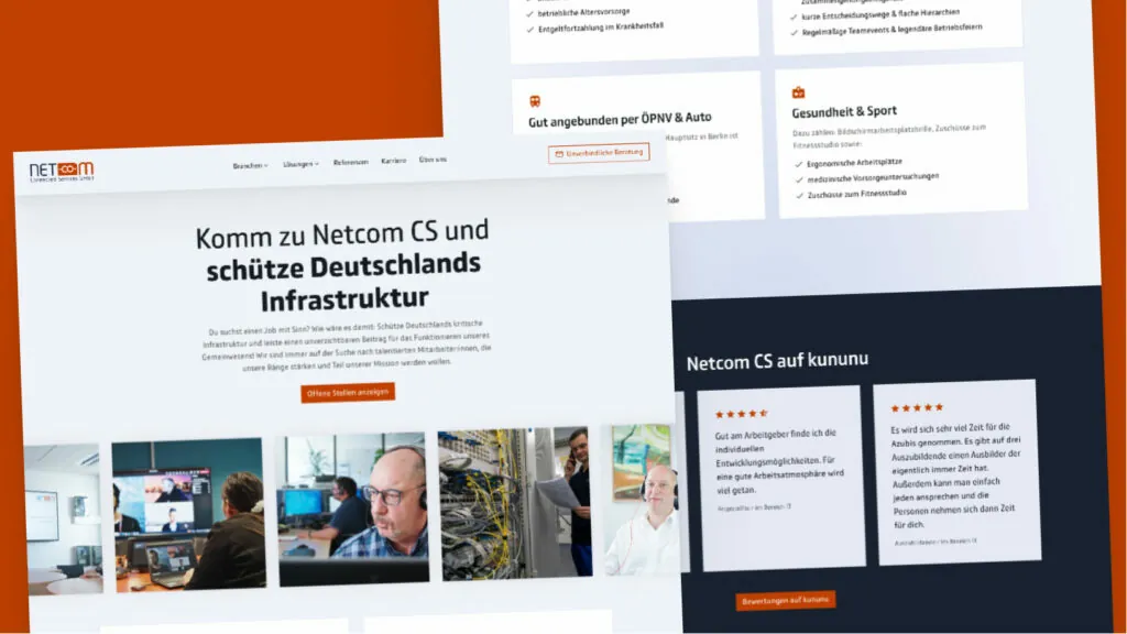
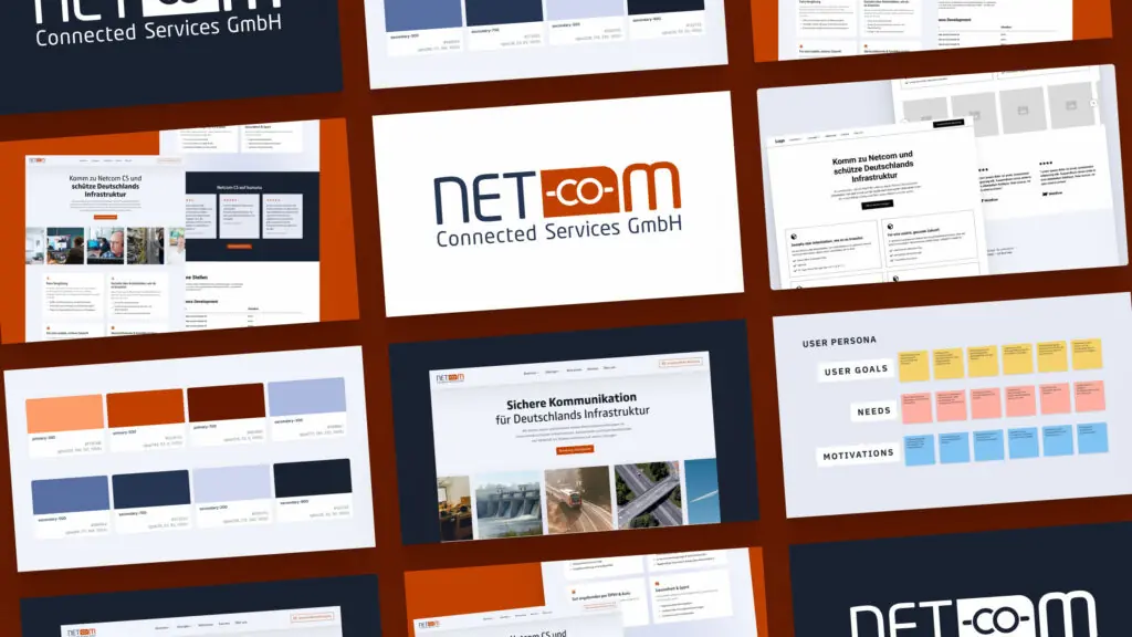
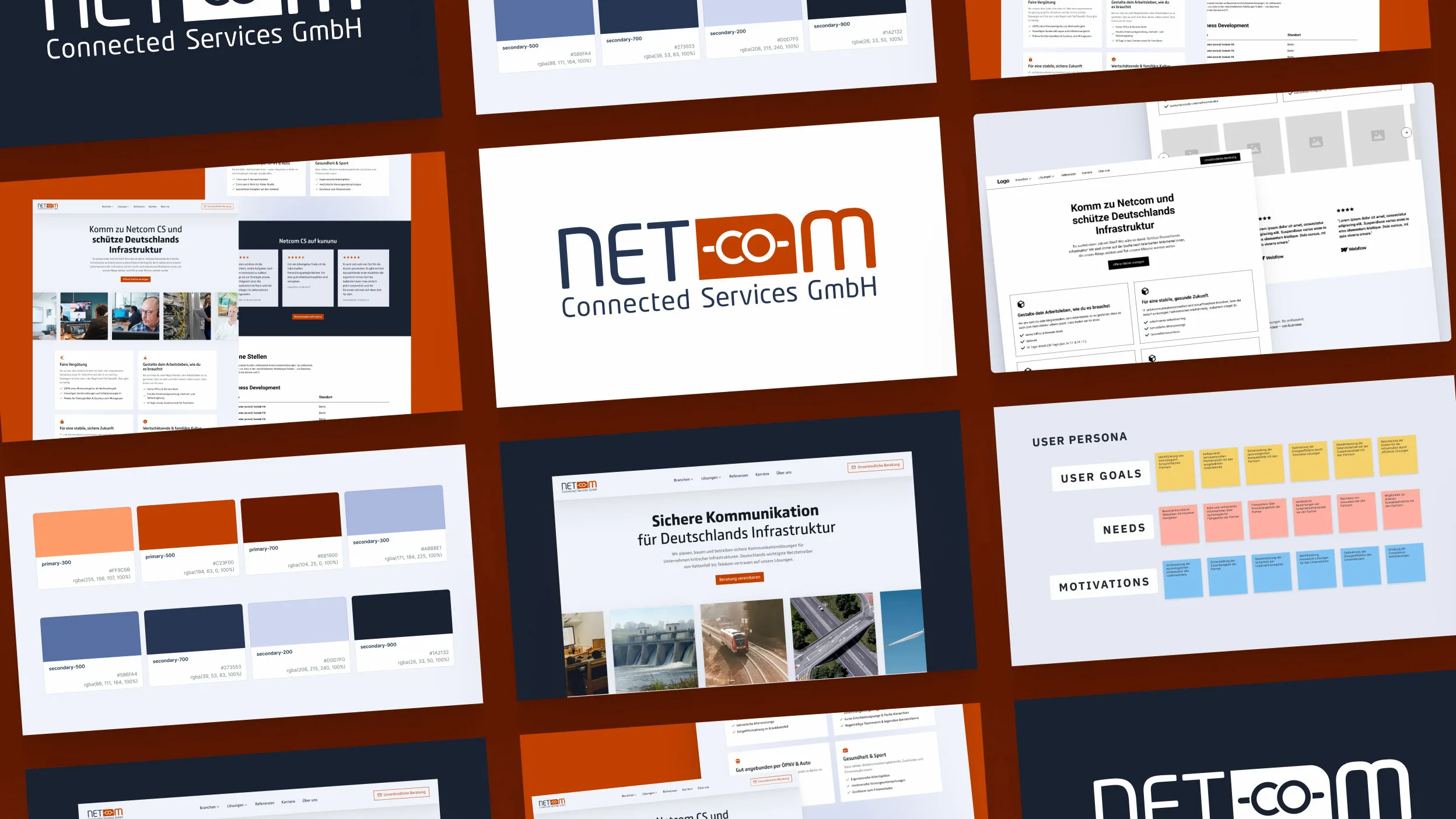
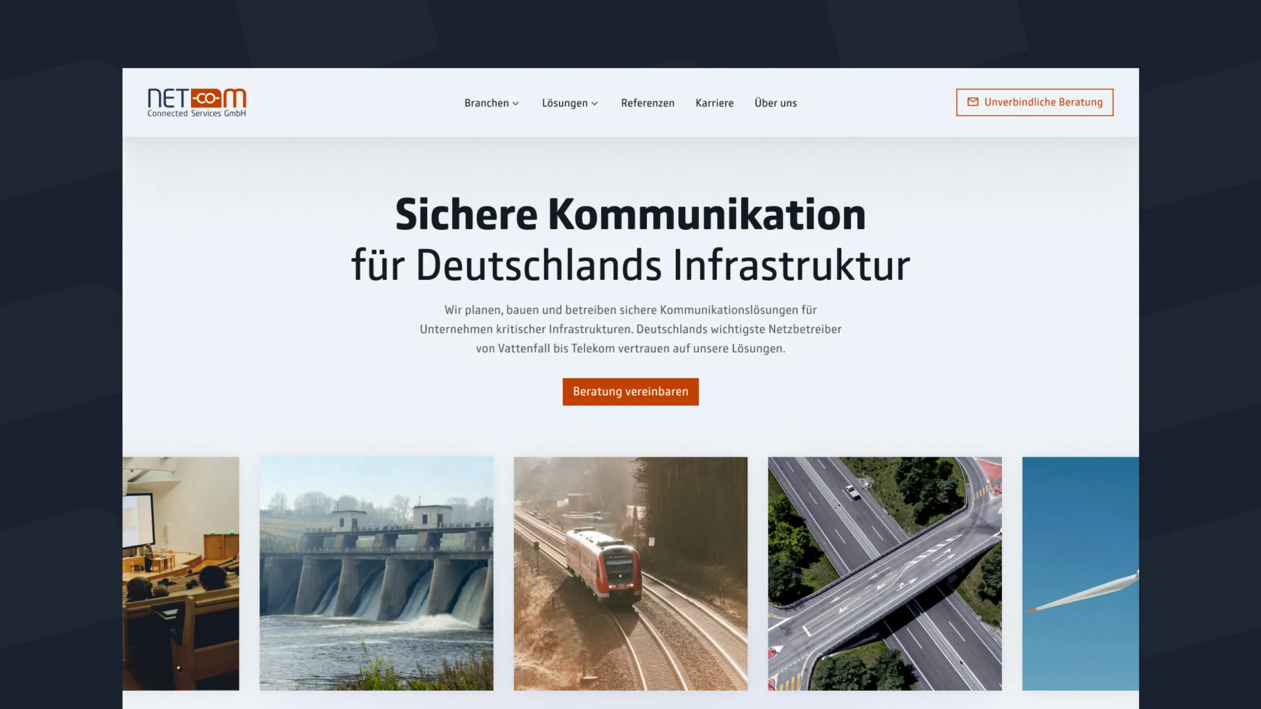
The Netcom homepage: clear focus on secure communication for critical infrastructure.

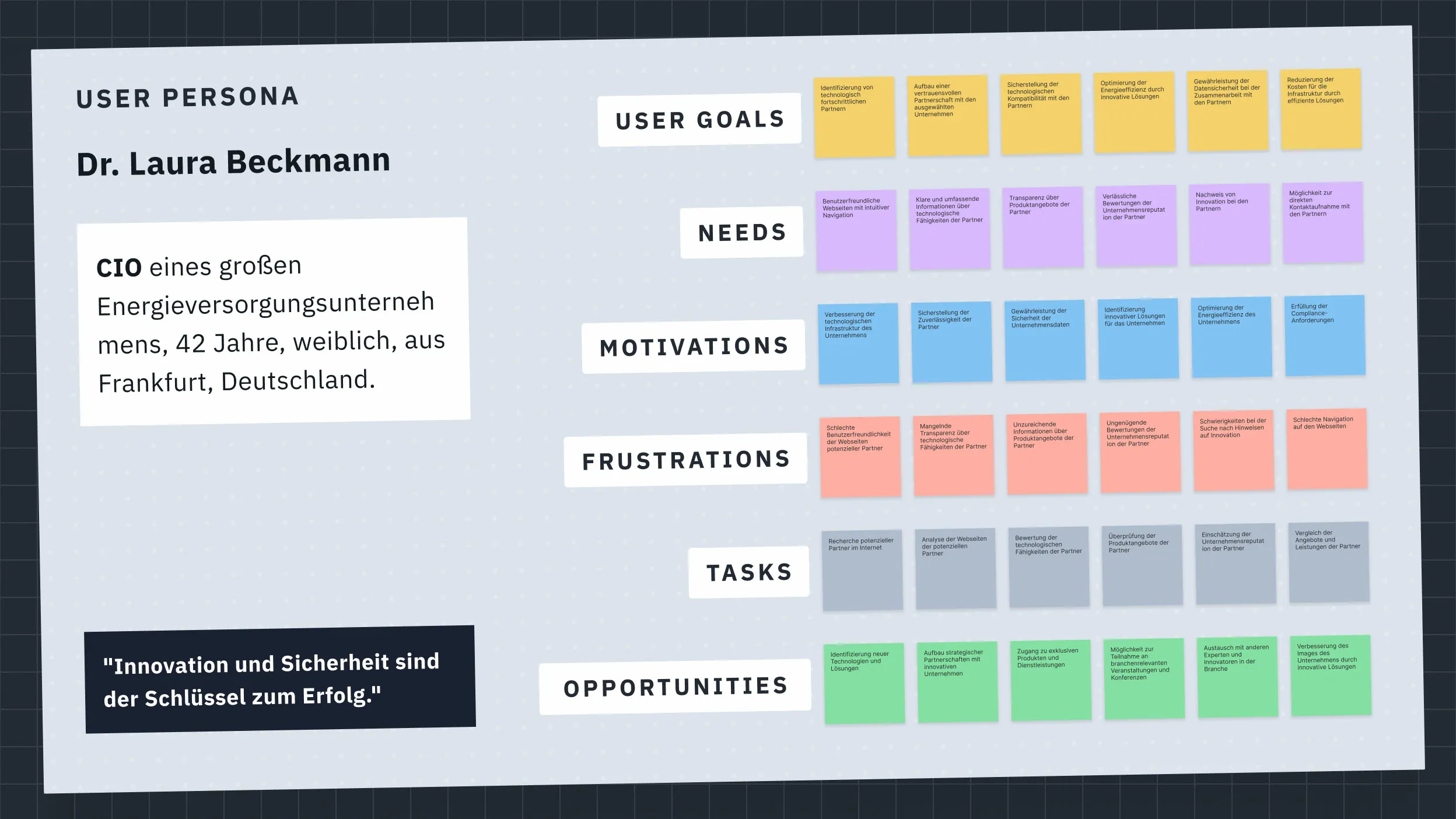
User Persona Dr. Beckmann: The basis for target group-oriented solution development.

Strategy

We broke up the flood of information with reduced, flexible templates. Each IT solution was given its own subpage. This not only made the content more readable, but also catapulted the visibility in search engines to the top.

We adapted the colors of the corporate design so subtly that the new look appears modern and meets accessibility standards without breaking with the familiar brand image.

For recruiting, we integrated Personio seamlessly into the website: job advertisements synchronize automatically. No manual maintenance, no duplication of effort. We also took over the complete content coordination for all new pages. Mission accomplished.

Screenshot der "Über Uns"-Seite für Netcom, die das Engagement für Sicherheit und ISO-zertifizierte Qualität im Bereich kritischer Infrastrukturen zeigt.

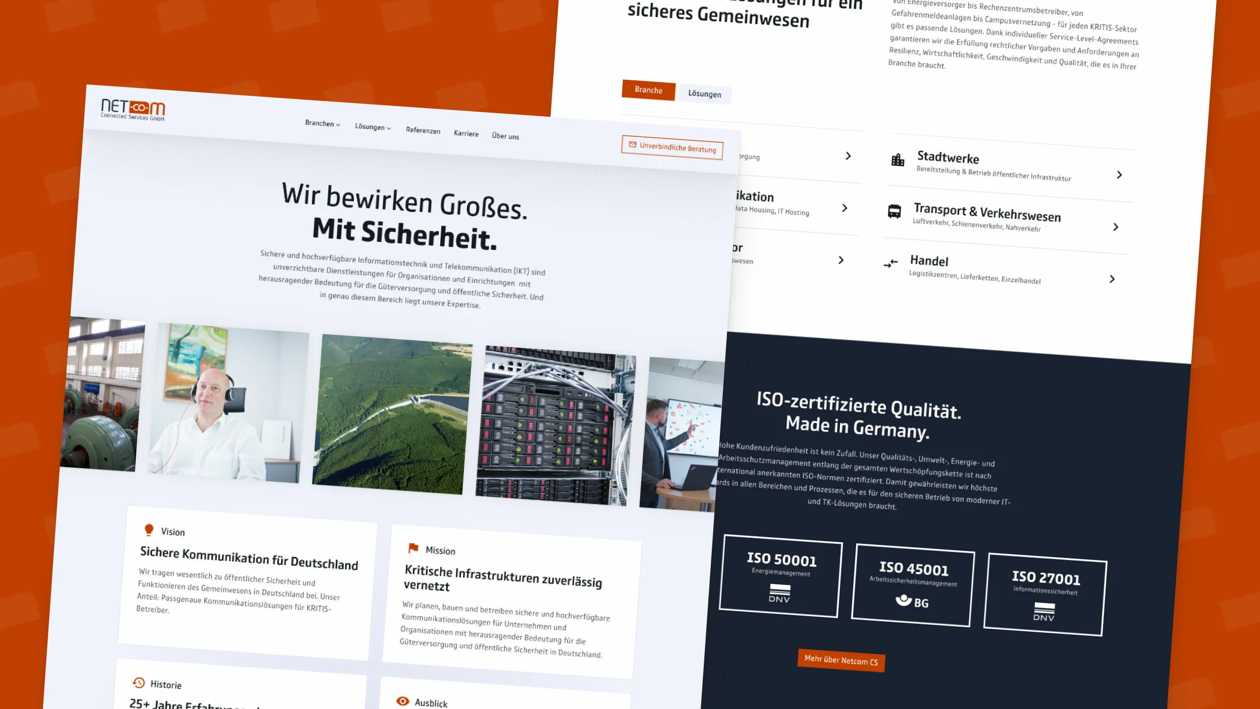
Netcom's "About Us" page: Focus on security and certified quality.

Die definierte Farbpalette für das Netcom-Branding, bestehend aus warmen Primär- und kühlen Sekundärfarben für eine starke Markenwirkung.

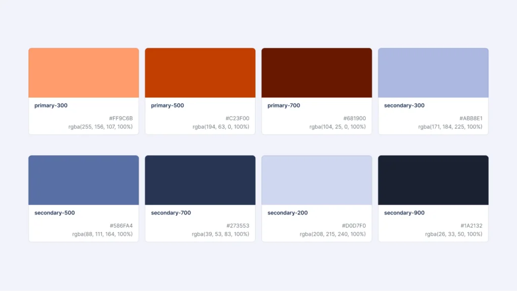
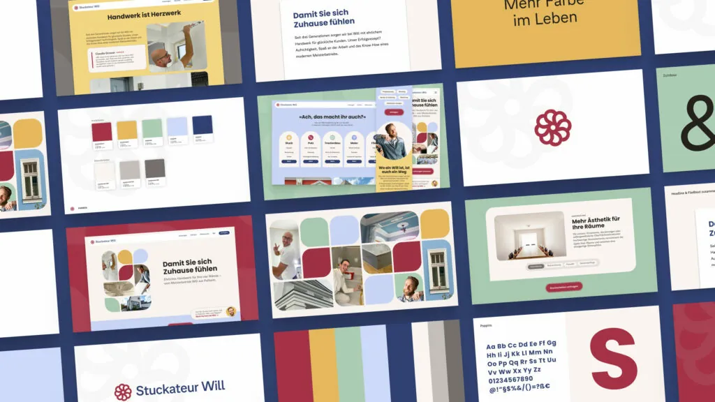
Netcom's color palette: a visual identity that radiates confidence and innovation.

Das finale Logo-Design für Netcom Connected Services GmbH, das Modernität und die Kernkompetenz im Bereich Vernetzung visuell vereint.

The Netcom logo.

Ein Wireframe der Netcom-Karriere-Seite, das den strukturellen Aufbau und die User Experience in einer frühen Designphase zeigt.

The first draft: The wireframe of the career page as a basis for user-centered design.

Ansicht der Karriere-Seite von Netcom auf einem Desktop, die mit gezieltem Employer Branding um neue Mitarbeiter:innen für den Schutz kritischer Infrastrukturen wirbt.

Netcom's ready-made career site: a modern portal for talents in the field of IT security.

Rigid corporate design, little room for maneuver? No problem. With a good structure and targeted color adjustments, we have developed a modern brand identity that radiates reliability and functions barrier-free.
Jannis Riethmüller, Designer

Result (not yet released)

The result is a digital powerhouse that makes the complex world of critical infrastructure tangible. A flood of information has been transformed into a clear structure. At the same time, recruiting is finally running on autopilot thanks to the seamless interface, attracting fresh IT talent in a targeted manner.

The transformation was well received: The customer was delighted with the modern appearance. Our main contact at the time was even promoted to CEO shortly after the project was completed – which of course wasn’t just due to the website. All in all, a successful system update.

Surprise! there's more.

And you thought that was it, didn’t you?

Looking for your new
favorite agency?

Discuss your next project with Lorenz

Lorenz is fluent in German, English, Spanish and whale sounds.