What happens when a housing cooperative and a bank dream together about the property management of the future? Relatively little at first – because our project started from scratch. No name, no logo, just the vision of a proactive property management company that wants to be more than just a property manager.
The working title “Digital Property Management” became Liveno: a premium brand that brings professionalism and approachability under one roof. Within six months, we developed a complete brand identity, from the naming to the accessible WordPress website. The result is an elegant “premium caregiver” that appeals to both investors and tenants.
Client
Industry
Service
Time Frame
Team
Tools
Barrier-free web design in accordance with the strict WCAG-AA standard for maximum accessibility.
From the blank page to the finished brand and the final web launch.
Budget utilization: thanks to enormous trust and highly efficient feedback loops.
We started with a blank sheet of paper. There was neither a name nor a brand – just the idea of creating a “digital property management company”. Two major stakeholders were (and still are) behind the idea: Sparkasse Vorpommern and the Greifswald housing cooperative (WGG).
The brand therefore had to bring two worlds together. At the same time, it had to look neither too much like a “financially oriented bank” nor a “social institution”. In addition, the name had to sound modern, but also remain accessible to older target groups in Western Pomerania. This meant that English names were off the table.
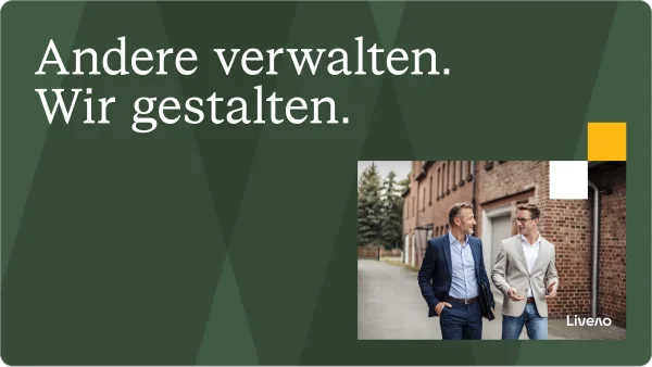
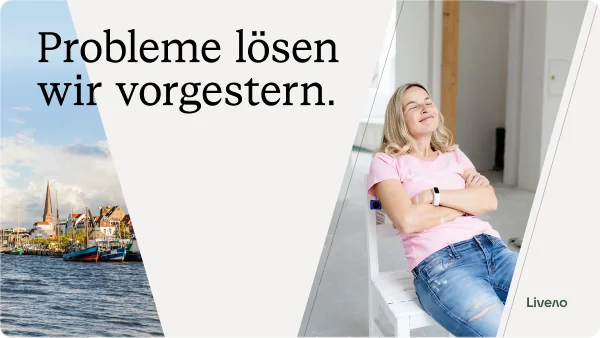
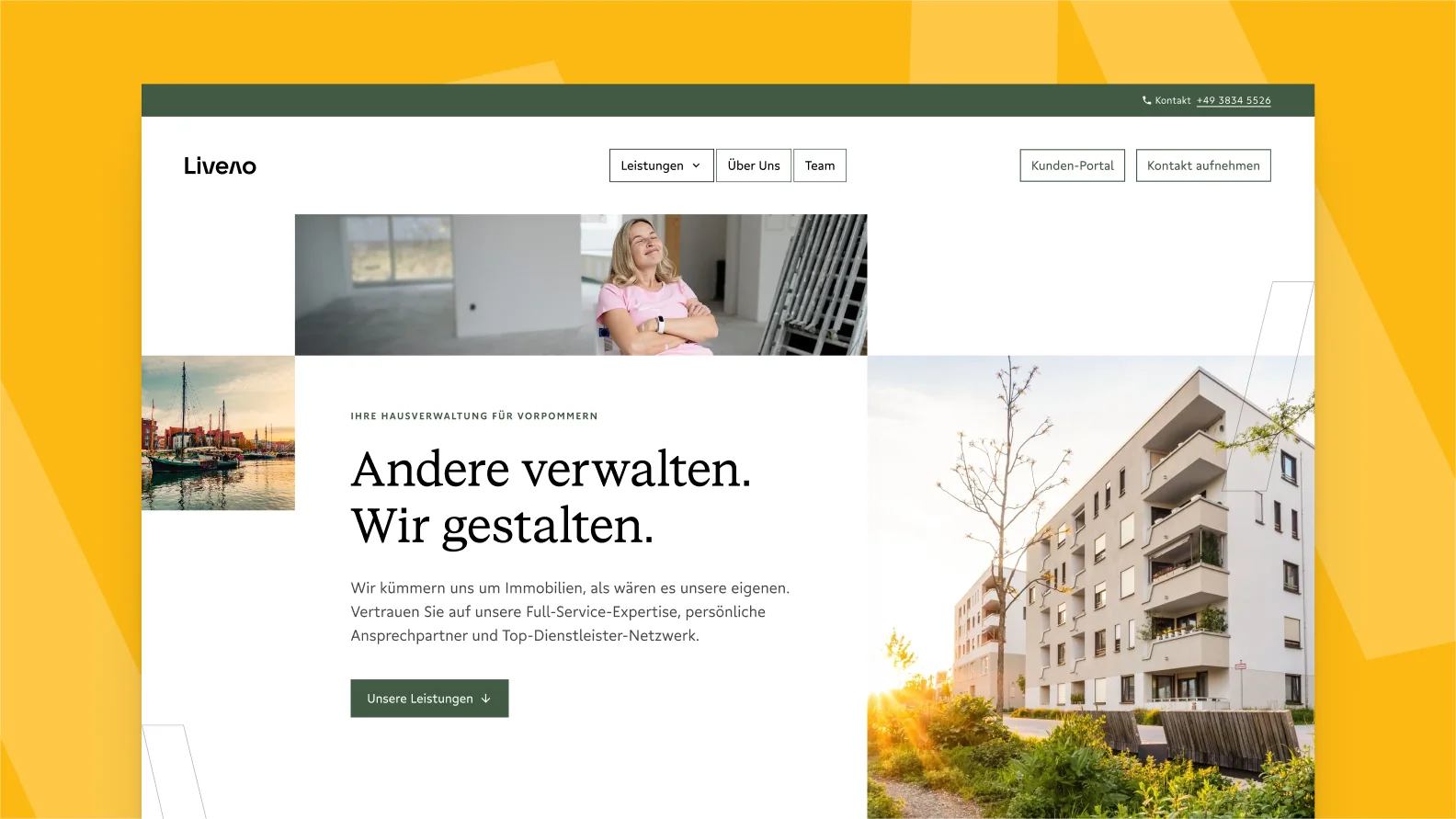
Home page of the Liveno homepage designed and developed by jut-so.
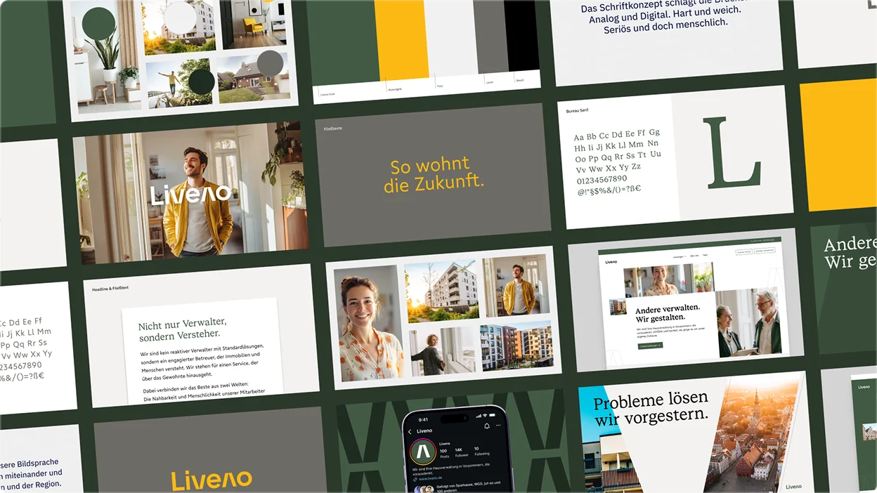
The Liveno logo follows a clear geometric structure.
We positioned the new brand around the “Premium Caregiver” archetype. It’s about the warmth and closeness of a cooperative – combined with the gravitas of a savings bank. In the naming process, we filtered out English terms and created “Liveno”, an artificial word that leaves room for interpretation and has a convincing sound.
Visually, we translated the brand identity into an architectural grid layout, combined with an elegant serif font and a muted color palette. The website is built on a lean, sustainable WordPress solution. It follows strict accessibility standards (WCAG-AA) to really pick up all user groups.
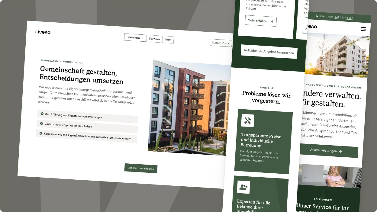
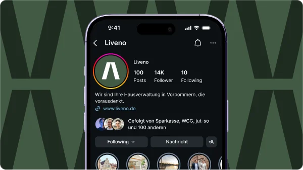
Responsive web design of the digital property management Liveno on desktop and mobile devices.
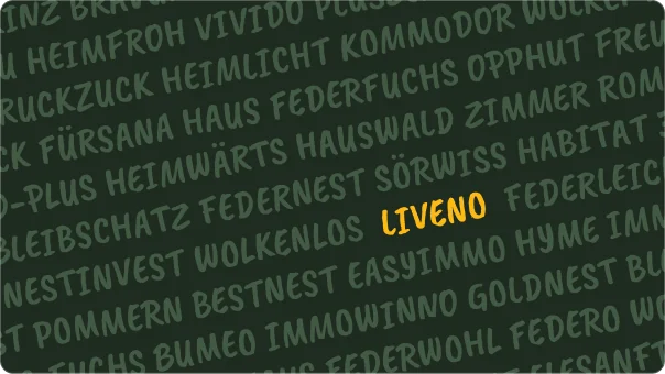
Finding a name for the Liveno real estate brand.
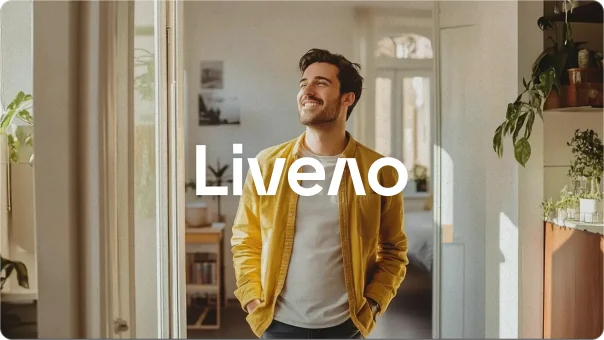
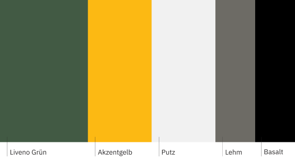
The visual language of Liveno is clarified and combined with the logo.
Today, Liveno is a strong, independent brand that combines the best of both worlds: the stability of the savings bank and the approachability of the cooperative. The design radiates calm and serenity. Particularly pleasing:
Thanks to the mutual trust and lean processes, the coordination went like clockwork. The website went live on time and even stayed under budget. The corporate identity we developed was very well received both internally and by the external target groups. This is how property management works today.
And you thought that was it, didn’t you?
Discuss your next project with Lorenz
Lorenz is fluent in German, English, Spanish and whale sounds.